Adding Va Va Voom To The Va Va Van!
Monday, 20 January 2025
We bought a new van for the Vialii fleet early in 2024 – a VW Transporter, a style we have coveted for a while! We spent a big chunk of last year discussing what style of signage we would add to it. It’s a different style of van from the rest of the fleet and is used by Michael to visit clients and sites so we decided we wanted a departure from the usual style of signage. Something eye catching which would suit the funky style of van but would still fit our brand. So we set about thinking about ways of adding va va voom to the va va van!
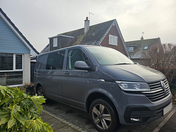
Before: the van was a little too plain to be a Vialii van!
The Design Process
Michael and I, being designers, started sketching up our own ideas. We were confident that we could come up with the winning design for the van (not that we are competitive when it comes to our designs!) We all loved the idea of a two-tone van so decided to incorporate that into our sketches.
- Michael opted for an Italian inspired retro look. Using the brand colours of pink and green he created racing stripes along the side incorporating the Vialii Gardens name.
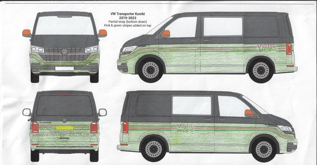
Michael’s retro design
2. Jill opted for a more hippy inspired look with a swirl of funky flowers cascading from the top back of the van down the side to the front.
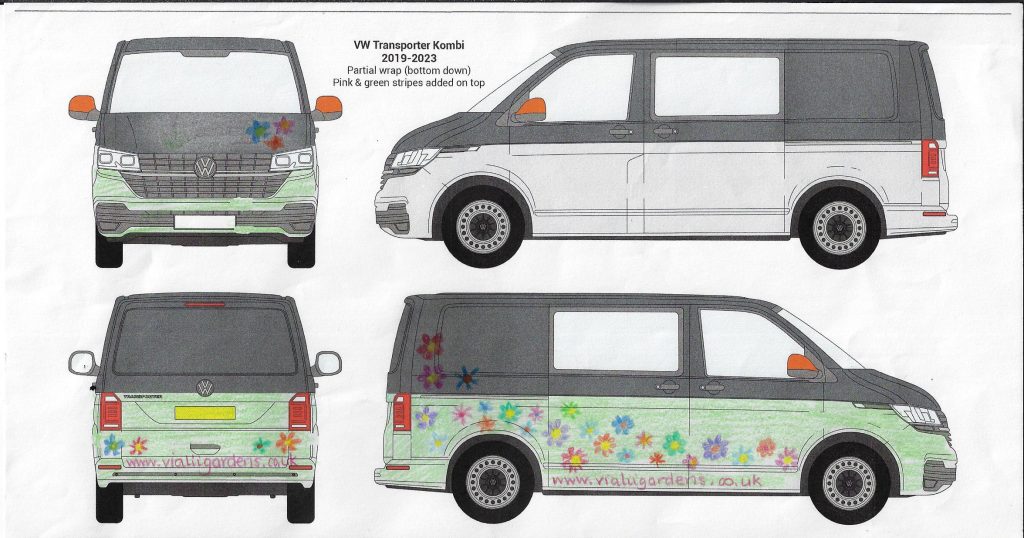
Jill’s hippy flowery design
When our daughters, Lulu and Tilda, saw what we were doing they decided they wanted to be part of the process and started working on their own designs.
3. Tilda had different designs on each side – one had a vine creeping along the side while the other had colourful sunflowers across it.
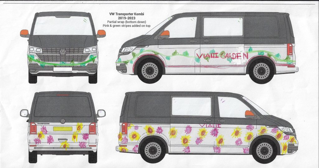
Tilda’s colourful plant based design
4. Lastly, Lulu worked up a design which also incorporated a two-tone look. The bottom was orange, tying in the orange wing mirrors which we got as a spare pair with the van. She then added a bold flower to the front wheel arch of each side.
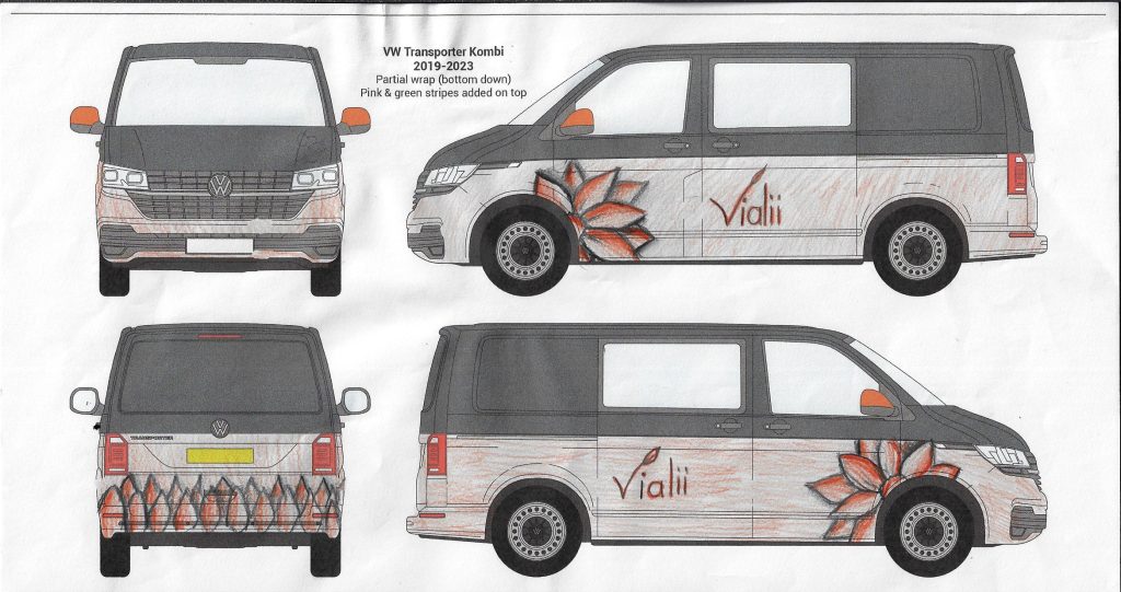
Lulu’s bold flower design
Choosing the Winning Design
With four different ideas we then did some focus groups, speaking to friends and clients to get their feedback.
Tilda’s was liked by everyone for being so colourful and interesting. Jill’s was deemed fun and funky and perfect if it wasn’t a Vialii van and just a fun van for going on trips! Michael’s was thought to be stylish but less eye catching than some of the others. But, to our annoyance, Lulu’s design was unanimously voted the best. And we’re supposed to the designers!! Everyone thought it was really bold and interesting and with some tweaks would be perfect for the business!
Bringing The Design To Life
So, with this feedback to hand, we set about working with the designer at Signs Express in Falkirk to create graphics that tied in with the business but stayed true to Lulu’s design.
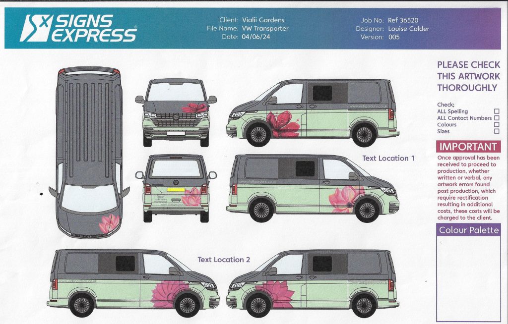
Playing around with different flower options
We loved the two-tone idea but as orange isn’t a brand colour we agreed with Lulu to change it to green on the bottom. We also changed the flower to be bright pink to tie in with the brand and played around with different styles of flower and placements of words. Sadly the shape of a primula vialii meant that wouldn’t work in this instance. After several months of going back and forward we finally came up with a set of graphics we were all happy with and got the van booked in for the work to be done early in the new year.
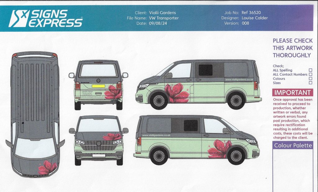
The finalised design ready to be brought to life
The Completed Van
We were nervous heading over to collect the van – this was such a departure from the usual look and we were drastically changing the look of the van we had grown to love by wrapping so much of it. But we shouldn’t have fretted – the finished van looked amazing!
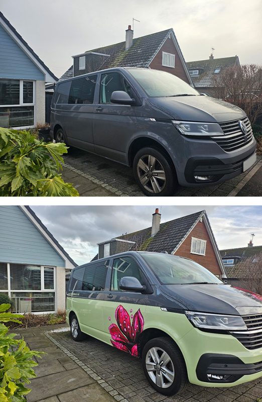
Before: a plain grey van. After: two tone loveliness
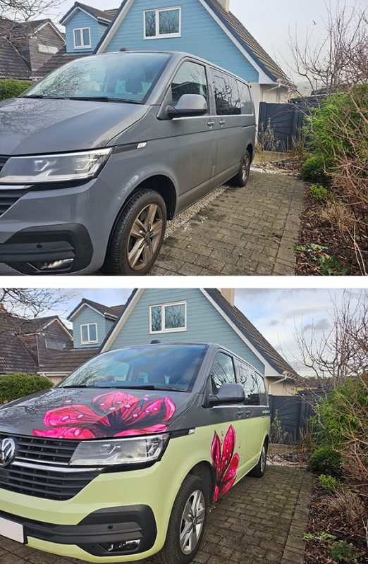
The pink flower is very eye catching
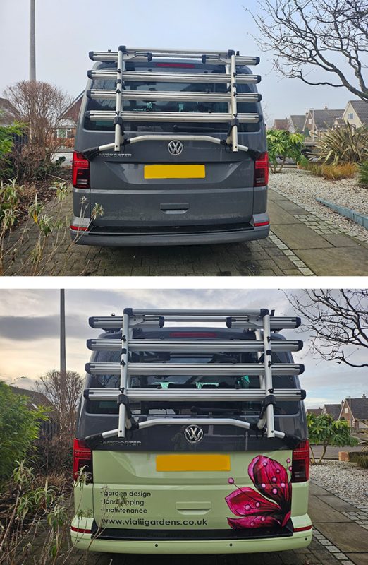
The company details are on the side and back of the van
It is certainly eye catching and hopefully will generate lots of business. We are very grateful to Andrew and the team at Signs Express for their hard work and attention to detail ensuring the tricky wrap was applied so well. We hope you love it as much as we do! Well done Lulu on an amazing winning design.
All at Vialii

